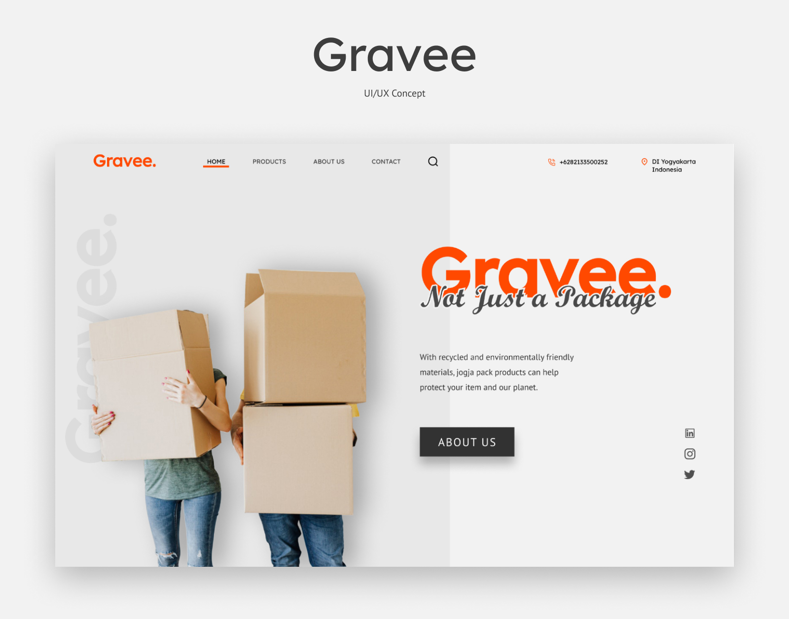
Gravee is packaging company. They make cardboard, duct tape, and bubble wrap. Gravee's priority is the safety of consumer goods in distribution until the goods are safe for users. The main purpose of this landing page is to direct users to buy or contact Gravee owners
WIREFRAME
A wireframe below is a wireframe that I will use to design the UI for the Gravee Landing Page. With a sans-serif typeface and buttons that don't have a border radius, it adds a sense of professionalism, elegance, and simplicity. It is hoped that users will be able to understand the character, products, and quality offered by Gravee

ELEMENT
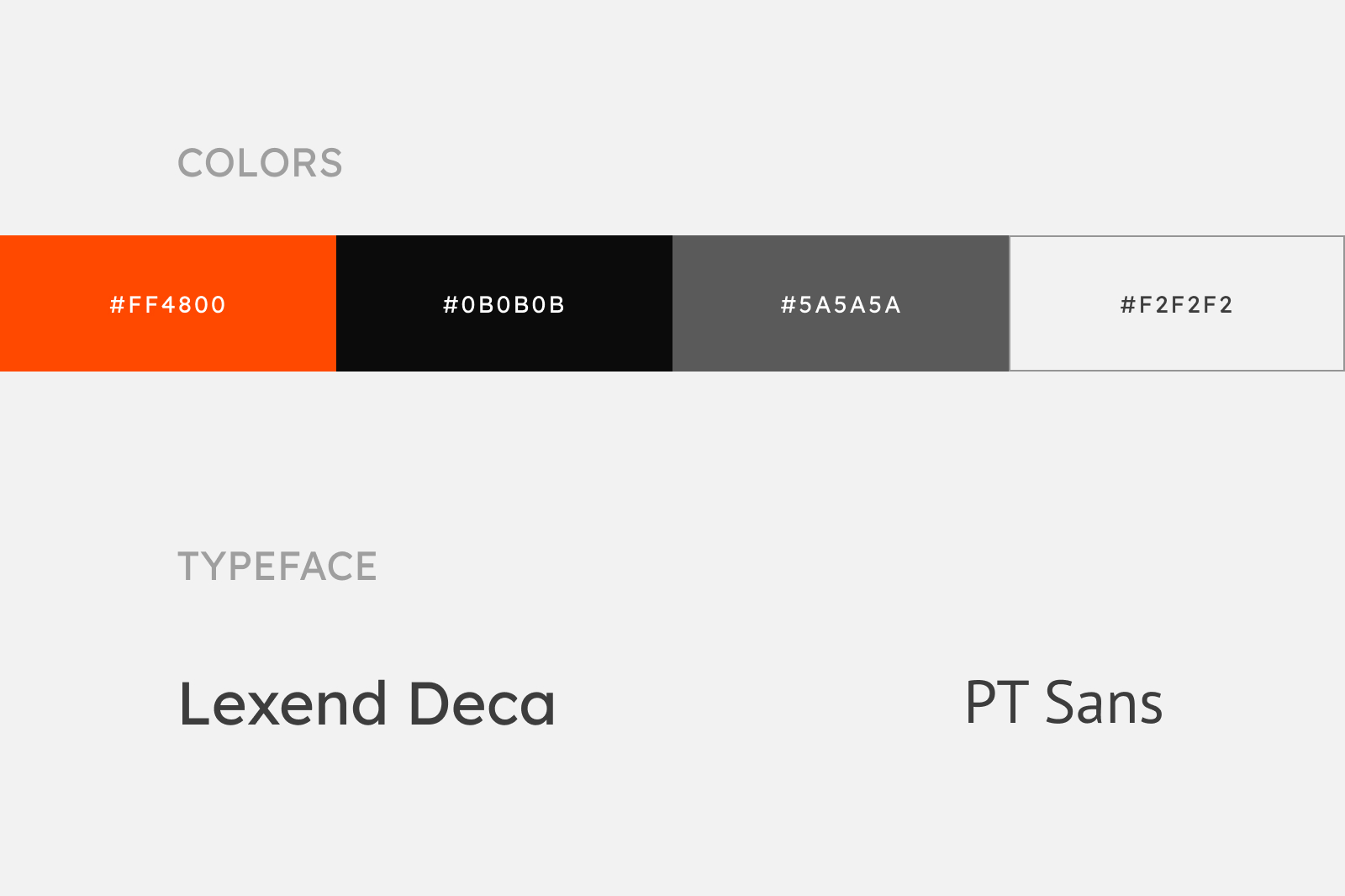
orange color is used in the header, and for the body text use dark gray. As for the background color, I used light gray and white. It aims to give an elegant and clean impression
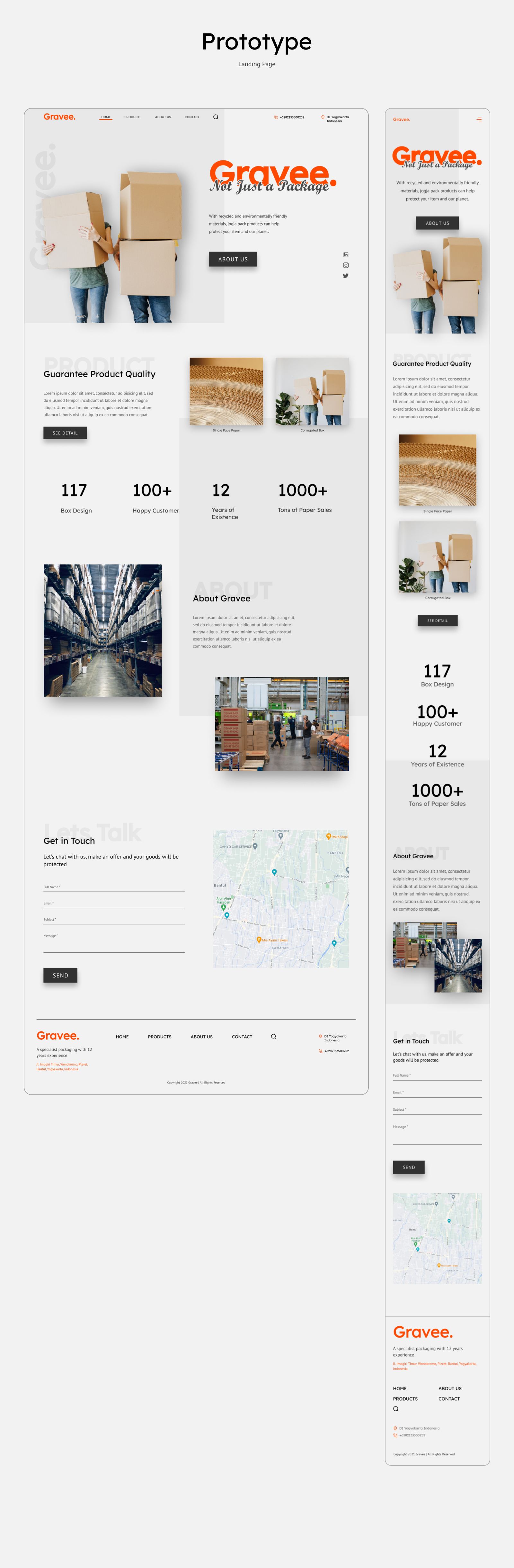
MOCKUP & PROTOTYPE